Wednesday, August 12, 2009

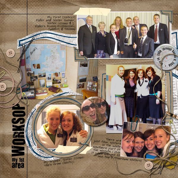
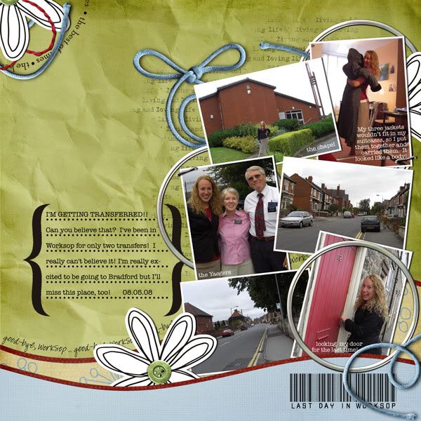
Last Day of Worksop!

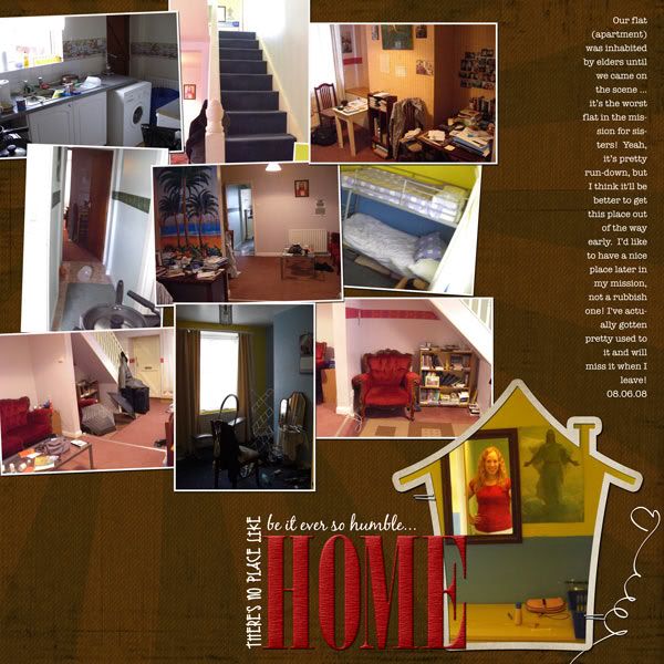
I scrapped Julianne's last day of Worksop ... so it's my last day of scrapping Worksop! Haha!

---

This layout was fun to do. I thought I'd try to match the red in the door, but instead I decided on green (a complementary color to red) to make the red really pop. I like it.


ScrapMatters Tuesday Template 08/11/09 (altered) by Man in the Moon Designs
Love Life by Sahlin Studio
fonts: barcode font and American Typewriter


---

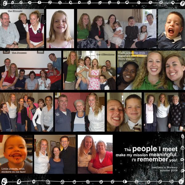
Then I went crazy -- I decided to essentially turn the previous page into a two-pager. The subject? All the little photos that were cute and/or pretty but not enough for their own layout! TWENTY pics on a page, baby! (Though I had to leave out seventeen more that had also been filed in my "miscellaneous Worksop" folder).


Tuesday Template 08/11/09 (altered a LOT) by Man in the Moon Designs

Love Life by Sahlin Studio
wordart is from Everyday by Megan Turnidge
fonts: American Typewriter


---

We're off to Bradford!

Tuesday, August 11, 2009

Coinciding of Transfers

My sister-in-law Julianne just got transferred to a new area out in England yesterday -- just as I'm just about to her first area in her album. Only, what, four or five more to go? (Yikes, this is a huge project!)

So here are the latest pages.

---

Not my favorite page. Is it the colors? I played with it for awhile and improved on it but don't love it. But not every page is meant to be loved. It's fine enough, I decided.


In the Neighborhood by Casey Krause
Dirty Boy alpha by Misty Cato
fonts are Elise and American Typewriter


---

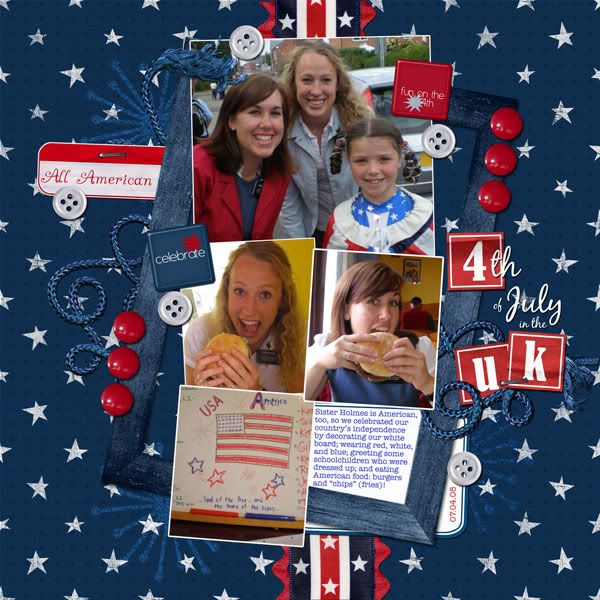
A tricky page because I tried to make it meet some guidelines for a formula challenge over at ScrapMatters. This took me entirely too long considering there are so few pictures on the page (yes, for the purpose of this album, I've decided that that's "few").

The page started out with just three pictures, though, and it looked a lot better ... but then I realized I'd forgotten the picture of the decorated white board. Stylistically it looks kind of weird to have it there (I tried to balance it out with the journaling tag, but I know -- it doesn't quite work), but I thought that pictures should take precedence over art.

I do love this kit, though. I'm glad to have an excuse to use it.


Stars and Stripes Forever by Chelle's Creations, WM[squared], and Designs by Tater
Saturday Special journaling tags by Chelle's Creations (freebie in the ScrapMatters store)
Teeny Tiny Christmas Alpha by Britt-ish Designs
fonts are Blackjack and American Typewriter


---

I took a break from scrapping over the weekend; I felt mildly frustrated that I wasn't "getting anything done" but it was rejuvenating, too.

Monday I sat down and cranked this out -- it one came together so fast, and without a template, too! I LOVE it! It's my favorite from this batch. I was so proud of myself for telling two stories on one page without it looking silly. And I learned a new Photoshop technique, too (I love the Saturday Special over at ScrapMatters). YAY. Love this page (did I say that already??).


Birds of a Feather mini and Birds of a Feather add-on by WM [squared] designs
Garden District bonus alpha by Pineapple Plantation Designs and Misty Cato
fonts are Everytime I Miss You and American Typewriter


---

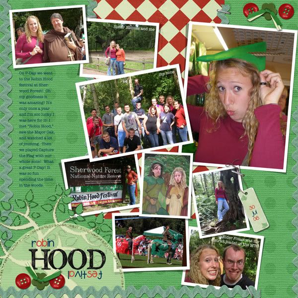
I was on such a high from the last page that I made the mistake of starting this one right away. Well, I guess my mistake actually was doing it in conjunction with that silly formula challenge at ScrapMatters. You see, some of the instructions really threw me for a loop ...

Use a template with an odd number of photos (it's Yin to the rescue!). Use shapes that aren't circles, rectangles or squares (I toyed with this instruction for forever and finally settled on the flower-shaped button). Use ribbons and staples and buttons and tags (played around with ALL KINDS OF STUFF for FOREVER). Turn something upside-down (which is why my title is weird. It's interesting but I know people are going to look at it and go, huh?? Don't blame them.). Use blue (this really doesn't work with my color scheme, but I finally decided that navy would not look too distracting. Stacy and Clinton say navy would go with anything. Right? Right??)

By this point, I was most definitely off my "scrapping high" and ready to just forget the challenge altogether. But I'd come so far ... and there was just one more instruction to go: shrink EVERYTHING (except the background) 10%. Well, I did it and it looked terrible. So I tried 5% and it looked slightly better, but I still had to play around with my elements for another fifteen minutes. I may or may not be disqualified since I didn't shrink it as much as I was supposed to, but yeah, whatever.

Now I really do like this layout; don't get me wrong. Fun colors and pictures and whatnot. But it was NOT worth spending an entire afternoon on.

Also: I hope I got enough of the pictures on here. I know -- there's NINE pictures on one page -- but she took a ZILLION. I felt bad leaving so many out!


Template 56 by Yin Designs
Family Ties blog freebie by Jeni Hopewell
tag and ricrac from Sense of Adventure add-on by Happy Scrap Girl
red button from Button It Up! sampler pack by Sarah Morgan Designs
green flower button from Mint Chocolate Chip freebie by Haynay Designs
staple from Sunshine in My Soul by Britt-ish Designs
Iron Alpha by Elegant WordArt by Bethany
fonts are smiley monster and American Typewriter


---

You'd think I'd want to stop scrapping after that, but I was determined to finish my scrapping on a good note for the day. I whipped up a layout as quickly as I could, with no thought to whether it would satisfy a challenge. It doesn't, and I don't care. It came together in thirty minutes.

I didn't think I really liked it all that much, but this morning when I was looking through the gallery, it caught my eye -- cool multiphoto layout; I like the colors and design, I thought as I clicked on the thumbnail -- and then I realized it was mine. Haha! Well, I'm glad I like it!


Love Lives template (altered) by Fei-fei's stuff
Bursting with Joy: Fall paper pack by Britt-ish Designs
embroidered monogram alpha by Danielle Young
fonts are Blackjack, An Accidental Kiss, and American Typewriter


---

Now here's simplicity at its finest. I used just a plain black background, simple fonts, and even blocking style. This is the best way to get a TON of photos on the page, I've found -- and a bonus: it's quick.

This actually does satisfy a challenge: to use a haiku in your layout. Never tried it before; I like it here.


Sparkle and Shine by Jennifer Barrette
Doodletime by Tracie Stroud
fonts: Arial and American Typewriter


---

The count for her album is at 22 layouts now. Originally I thought I'd shoot for 100 or so, to fill up a Winkflash book. Now I'm not sure whether it will fit in one book. :-P But seriously ... more than 100 pages? I'd better not think about it!
Wednesday, August 5, 2009

More for Julianne (again)

Susan said she was anxious to see the latest in Julianne's album, so here they are!

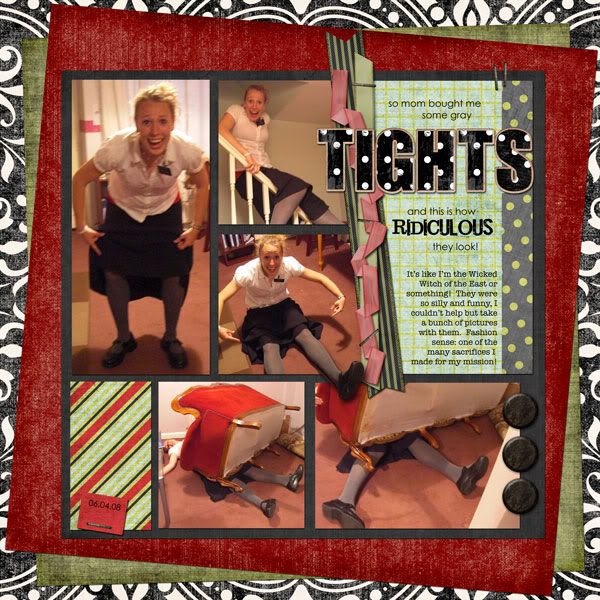
This layout can't help but be awesome just because of the pictures. Aren't they great?? So Julianne.

But here's my question: are opaque gray tights really so fashion-backward? Because I totally had a pair when I was in college that I wore every Sunday throughout the winter ... for years. I thought they were great! And they really held up well. Of course, this was, like, ten years ago, so maybe they really are that bad now. (Man, I'm old.)


Tuesday Template 7-28-09 (altered a bit) by WM[squared] Designs
15 across, 42 down by Ziggle Designs
several papers from Dinner Party by Shabby Princess and Sara Carling
staples from Apple Cart #1 by Ziggle Designs
Polkee-dawt alpha by Britt-ish Designs
fonts: Century Gothic, Jailbird Jenna, and American Typewriter


---

I struggled with this next layout. Don't get me wrong -- the pictures are beautiful and I am pleased with the overall result -- but I was scrapping while my kids were wreaking havoc.

Okay okay -- here's the whole gruesome story:

First off, naptime was a total bust at my house that day. So was "quiet time," really, though the kids did seem to be somewhat entertained playing in the toy-pit that is our basement while I scrapped at the desk in the corner. So I went ahead and started on this page.

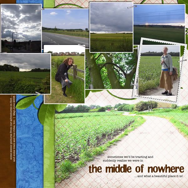
I was trying desperately to turn a four-photo layout into a nine-photo one (I was looking to lift a layout I spotted in the gallery because I loved how she stacked her background papers). But how could I do this without totally covering up the stacked papers that I loved so much? And besides -- scenery pictures are really hard to scrap, I've decided. Typically the reason you take them in the first place is to show the beauty of it, and I didn't want each little photo to be overwhelmed by all the others ... but then I didn't see any other way around it (because it also seemed pointless to scrap each of these photos by themselves)! The whole thing was enough to give me a conniption.

Meanwhile, my two-year-old had stopped playing with his toys and was tearing apart daddy's nice headphones. Nathan is generally laid back about the kids touching his things -- but the headphones are sacred. I felt sick when Logan showed me the ear piece ripped off and wires exposed.

And then, a minute later, my computer abruptly rebooted itself and I hadn't saved ... not a thing. An hour's work down the drain!

It probably was a mixed blessing in disguise, because while I went upstairs to cool off, I was able to see in my mind how I could get this layout to work. Awhile later I came downstairs and rebuilt the page in maybe half an hour.

And Nathan's headphones? He soldered them back together. With his soldering iron. And they work. (Yes, he's the man.)

So. All's well that end's well, I guess.

Here's the famed (infamous?) layout (which I actually really like):


this was inspired by kimbytx's Doctor M
Natural Wonders by ScrapMatters Designers
staple is from Sunshine in My Soul by Britt-ish Designs
fonts are American Typewriter and Clingy


---

This one was more therapy-scrapping than anything else. After the last layout, I wanted something that would come together quickly and easily. Ask any scrapper which kind of layout is easier -- one with nine photos or one with three -- and I'm guessing they'll all say three. This was the case here, and while this doesn't give me as big a bang for my buck photo-wise, it was a layout I could do in under an hour.


A lift of becca372's "cutest"
Where the Heart Grows by Golden Girls Digital Designs
font is American Typewriter


---

The boys did take naps today, and while Josh's was way too short, I was able to get the bulk of this done while they slept.

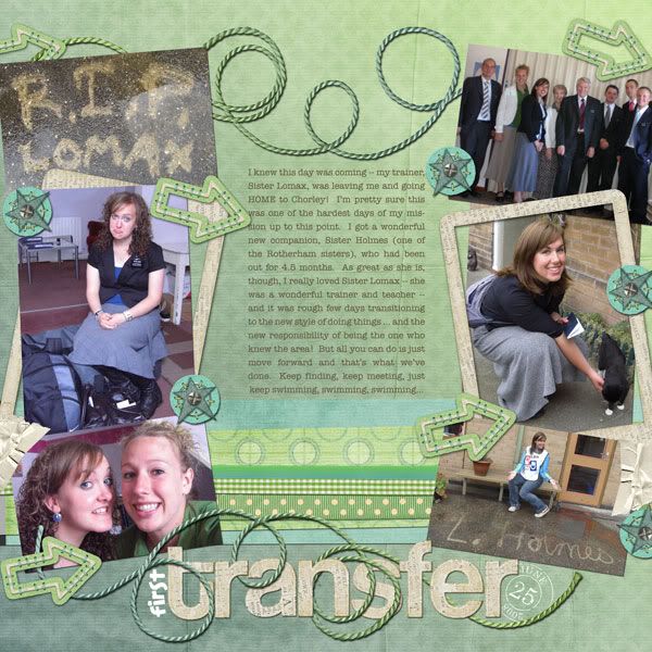
It was really quite lucky that I chose this kit -- I try not to spend a long time picking when I'm doing these pages, so when I saw Julianne's green shirt and Sister Lomax's blue one I went for this blue-and-green kit I knew I had stashed away. Then I saw the gradient paper (and the gradient string) and the arrows and thought, hmm -- how appropriate for scrapping this transitional page! It matched the journaling well (which I adapted from a few paragraphs from her e-mails and photo captions ... this is what I've been doing for all the pages, actually, and I'm indebted to April for all her work in getting that up and archived on the web so it's accessible to me!)

One more thing regarding my color scheme -- the bottom right picture was SO distracting originally, what with its bright sunny colors: the door was red, the bench was a vibrant teal, the window sill was lemon-yellow. I used the selective-recoloring trick from a past Saturday Special and, voila -- instant paint-job! I so wish I could Photoshop my house!!


Template 10 by Scrapmuss Designs (ScrapMatters' Tuesday Template for 08/04/09)
SYTYCD Week 1 by Studio Flergs
Give It to Me Straight by Amanda Heimann
My Ribbon Jar by Britt-ish Designs
Date Stamped by Britt-ish Designs
fonts are Elephants in Cherry Trees and American Typewriter


---

Thanks for looking! (And remember: command-S is your friend!)

Saturday, August 1, 2009

Some Catching Up

All right, time to catch up on layouts! I've been scrapping up a storm lately!!

---

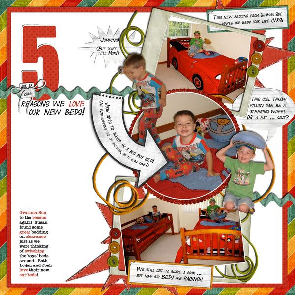
So ... I love this one. One of my favorite layouts of all time. The design, the element placement, the colors -- yeah. Love this. (Is that vain??) It earned a spot in the gallery standout thread at ScrapMatters.


Jokes on You by Sweet Digi Scraps
We're Just Dating v.2 by Britt-ish Designs
fonts: Year Supply of Fairy Cakes, You Are Loved (for the "5"), American Typewriter


---

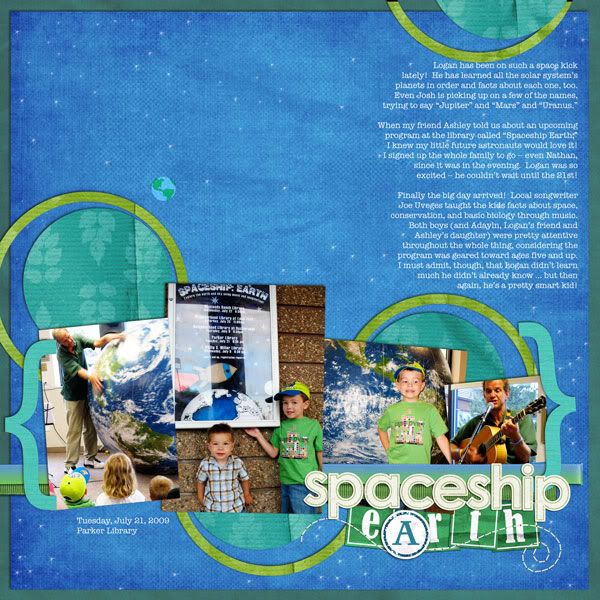
This one I did for a color challenge at ScrapMatters, and I LOVE how the colors turned out! The 60-30-10 rule in the tutorial that accompanied the challenge really worked. And the template I picked turned out to be awesome -- the cut paper looking like planets was a happy accident that I was happy to reinforce by painting "stars" across the paper using one of Photoshop's standard brushes.


Queen of Scrap template by Denise Beatty Originals (modified)
Natural Wonders (a lot recolored) by ScrapMatters Designers
Teeny Tiny Christmas Alpha and Glitzy Paper Dot Alpha by Britt-ish Designs
earth is from Earthday by Plum Dumpling Designs
ribbons from My Ribbon Jar by Britt-ish Designs
stitching from All Stitched Up by Tracie Stroud
font is American Typewriter


---

A page for Julianne's album. The bulk of these papers and elements were downloaded from kits for DigiScrapAddict's So You Think You Can Design contest.


Recycled! by Lindsay Riches
Junk Drawer by Fernlili's Digital Designs
tape from Adventures in Reading by Plum Dumpling Designs
flair by Melanie Fuller (from Ellie's Angels blog)
fonts: You Are Loved, Pea Carlisle


---

I did this for a speed scrap on Thursday night, and what a speedy scrap it was! It started at 7:30, but I had forgotten about it until I uploaded the previous layout at about 8:15 and noticed that thread in the "new posts" of the ScrapMatters forums. But I couldn't sit down and scrap -- we had to put the kids to bed (which has become quite the ordeal since my youngest moved into this new bed ... he was fine the first few nights, but it's gotten worse; what's up??) Anyway, I didn't sit down to scrap until ten minutes to nine, and I had until 9:45 to complete and upload my layout. Typically it takes me at least ninety minutes for a layout -- so I was a little rushed! But I made it ... with five minutes to spare. What's my secret? Well ...

It definitely helped to read the instructions before putting the kids down, so I was thinking about things for about a half hour before I started (and changing my mind over and over and over about what set of pictures to scrap).

It helped to kind of "lift" my previous layout -- I used a lot of the same techniques (which I figure is fine, as they aren't even going in the same albums).

And it definitely helped that the host of the speed scrap, Rachelle of Chelle's Creations, totally scraps in my style -- more about the pictures and journaling and less about the frou-frou. (There have been times that I think about joining the speed scrap, see that the first instruction is "pick ONE picture", and I give up right then and there. Sometimes I enjoy that kind of challenge, as it's so different from my typical layout and I like to try new things and grow, but lately I just have too many layouts that need to get done, and none of them are single-photo layouts!)

Anyway, the instructions included things that might be a struggle for some scrappers -- at least five pics, at least 50 words of journaling, etc. -- but those are almost second nature to me. (The other rules were easy to follow, too: things like adding blue and/or gold to the layout, using brackets, using paint splats, having a title and a subtitle).

Um, I think I've taken almost as much time to write about this layout as it did to actually create it.


paper and brackets: Natural Wonders by SM designers
Glitzy Spills and Thrills by Britt-ish Designs
Sparkle and Shine by Jennifer Barrette
fonts are You Are Loved and American Typewriter


---

I was so excited to have finished that speed scrap, and not just because I knocked off a layout I've been meaning to do for months ... the participation prize was a beautiful (beautiful!) paper pack. When I saw this particular paper, I knew just what to scrap with it. Doesn't it look like water??


tilt template by Britt-ish Designs
Color My World paper pack by Chelle's Creations
Sunshine in My Soul and Sunshine in My Soul add-on by Britt-ish Designs
My Ribbon Jar by Britt-ish Designs
Pinky-Dinky alpha (recolored) by Britt-ish Designs
font: American Typewriter


---

Thanks for looking!