Well, I've been doing just a little bit (haha) of scrapping. Here are my layouts since last time!
---
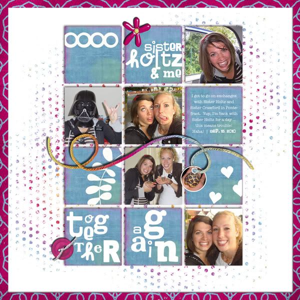
I've decided it's become easier, generally speaking, to scrap without templates lately. I spend entirely too long trying to find someone else's design that will fit the photos I have; besides, at 150 pages into this album, I've used almost everything decent in my stash already! Rather than alter a template to make it work with my photos, I've been coming up with the designs myself. Often I'll think on them for awhile throughout the day and by the afternoon it comes together pretty quickly. Here's one such example:
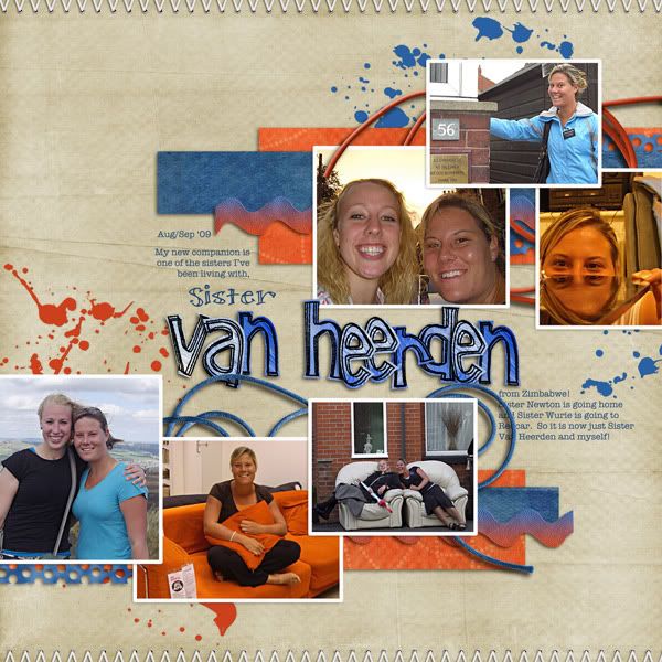
Boy Wonder by GG Digital Designs
stitching by GG Digital Designs
Art Box Alpha by Holliewood Studios
Get Real - Realistic Drop Shadows by Jennifer Barrette
fonts: sf Fill Me In, American Typewriter
---
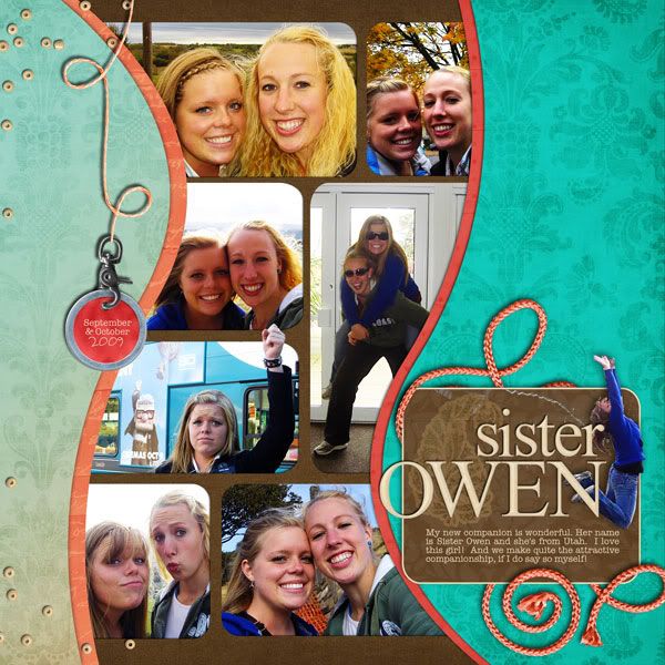
I love this layout! Funny since I didn't love it when I started scrapping it. Another case of trying-to-use-a-template-that-didn't-fit-my-photos. I laid everything out once and didn't like anything except the alpha I was using, so I scrapped (haha) the entire layout and came up with something new. This time I started with the titlework (I never start with the titlework ... do you??) and added some fun road-type elements and the whole thing just came together.
Further confirmation of my scrapping-without-a-template movement. ;-)
(Oh, and read this story Julianne shared with these pictures. It's crazy!)
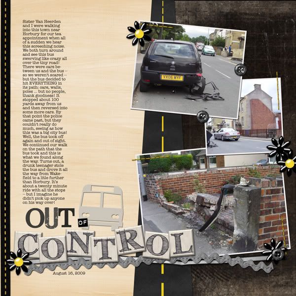
tan paper from Midnight Crow by Chelle's Creations
black paper from Dreaming in Color by Nicole Young
road from Around the World add-on by Britt-ish Designs
Jellies Blooms by Britt-ish Designs
stitching, black and yellow ribbon from So Long to Summer by Andilynn Designs
tag, buttons, and gray ribbons from Losing It by Andilynn Designs
bus (extracted and recolored) from The Journey by ScrapEvangel
Wild Oats bonus alpha by Sarah Bennett
fonts: Jailbird Jenna, American Typewriter
---
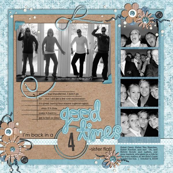
I liked that I was able to get a lot of rather random pictures together on this page.
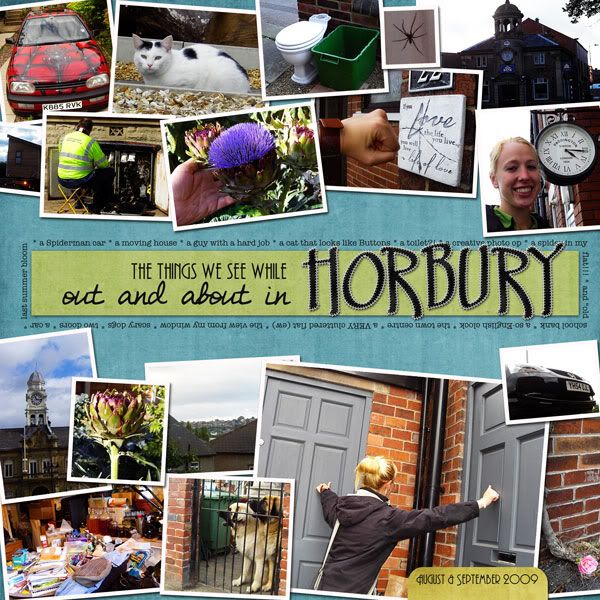
Boys Are Trouble by Jennifer Barrette
Autumn Festival Felt Alpha by Ziggle Designs
fonts: Andes, DJB Get Your Fix, American Typewriter
---
This one was really fun, and I love that the color scheme was already chosen for me! What great pictures Julianne took, too!
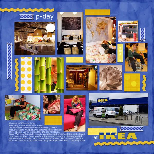
blue background paper and blue ribbon from Happy Hanukkah by Andilynn Designs
ricrac, staples, and some yellow papers from Bright Sunshiny Day by Andilynn Designs
some yellow papers from Way to Be by Andilynn Designs
fonts: Verdana, American Typewriter
IKEA logo copyright IKEA. For this layout, I used the logo found on the Swedish American Chamber of Commerce: San Diego website (found using a Google image search).
---
I managed this one without a template, too. I like the titlework. :-)
Pure Perfection by Stolen Moments
fonts: My Own Topher, Waterfalls, Impact, American Typewriter
---
If this design looks familiar to you, it's similar to the Valentine photo shoot page I did of the boys, but flipped. Not a lot of extra elements, but with so many photos, I think that's probably for the best.
Lady Scrapalot by Sir Scrapalot Designs
fonts: Howser, American Typewriter
---
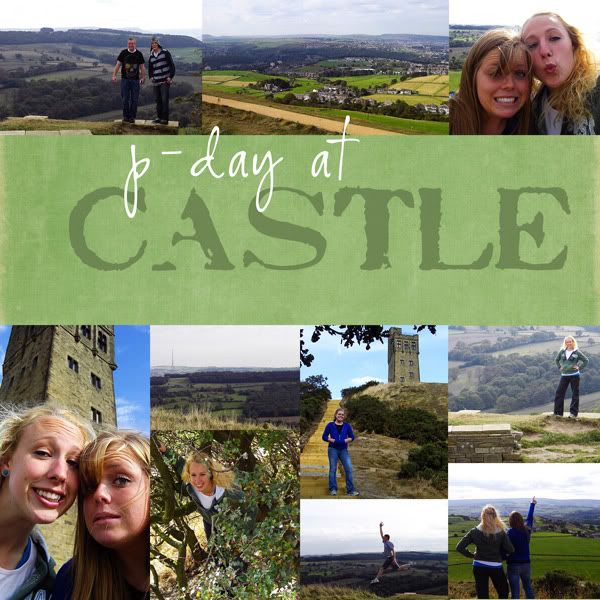
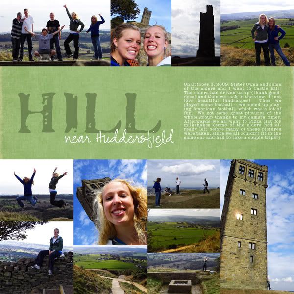
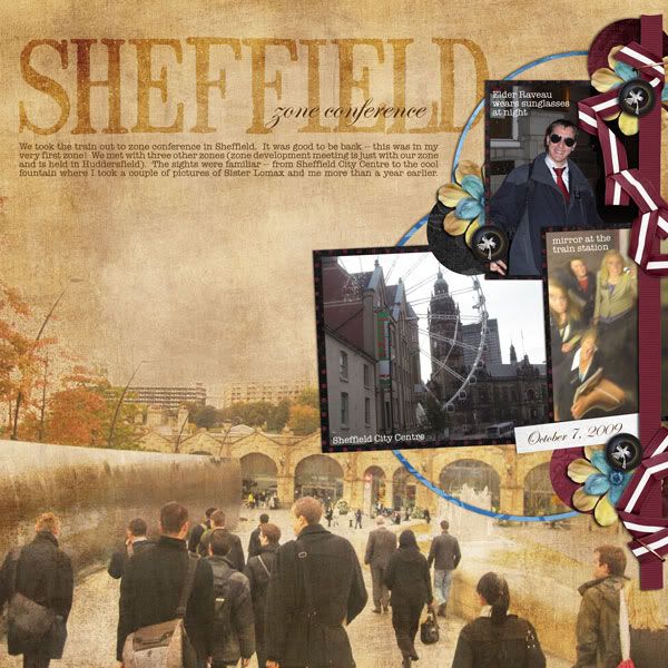
Julianne took so many pictures this day; even with a two-pager I only used about a third of them. They were all so great! Hopefully I did the photos justice.
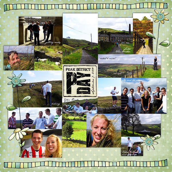
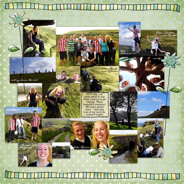
Fresh Air by Amy Stoffel
inked edge (trimmed so it looked more doodled) from Building Blocks by Chelle's Creations
P-Day wordart from Called to Serve (April LDS blog train): 3 Missionary Word Art by The Latest Scoop, Too
fonts: Jailbird Jenna, JaneAusten, American Typewriter
---
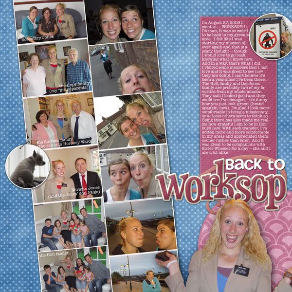
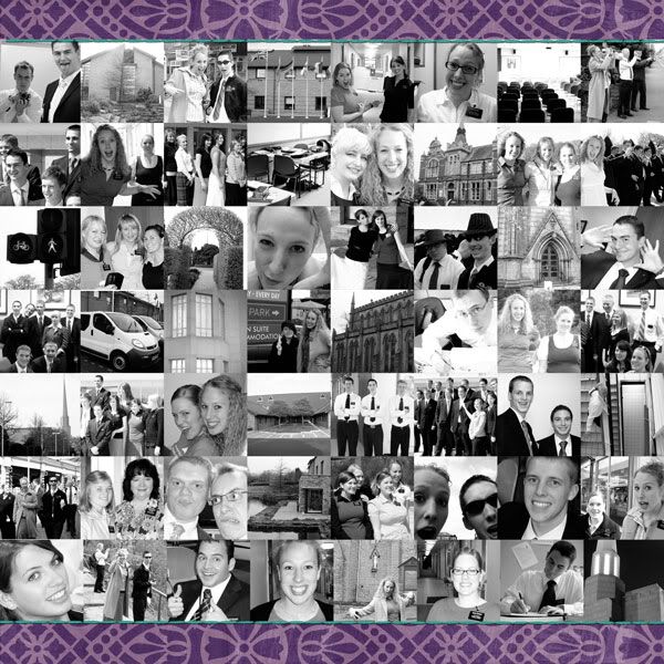
Okay, I gotta tell the story behind this two-pager. Julianne didn't have any MTC (Missionary Training Center) pictures since that memory card was stolen out of the mail, so she solicited her friends when she got home and posted a TON! I wanted to include them in her album, but at the same time, I was not about to go back and scrap 700+ photos from the beginning of her mission! The idea of doing sort of a flashback page to accompany these pictures from the Horbury area sounded like a nice compromise.
Still, it was a daunting task! I spent the time that morning contemplating how I wanted to design this page and came up with the idea of doing black and white photos for "past" MTC photos -- everything would look more cohesive that way.
Despite all my planning, this page still took a long time! Usually I can scrap a layout in 1-2 hours (actually, it's more like one hour now -- I think all my scrapping "practice" has been paying off), but I think this one took more like four hours just because of the sheer volume of pictures that ended up on this layout: eighty-six (eighty-six!) pictures on this two-page spread!
I really like how it turned out and think it will look nice in the album ... and I like it even more now that the memories of making it are not quite as fresh. ;-)
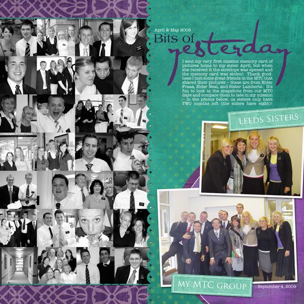
purple background paper from Lucky Me by Miss Mint of Peppermint Creative
teal paper from Definitively Defined (BRIGHT) by Nicole Young
dark purple solid paper from Fresh Fruit by Pamela Donnis
lighter purple solid paper from Under Sea Adventure by Jennifer Barrette
scalloped edge created using Paper Shapers: Fun Mats by Britt-ish Designs
stitching recolored from Fall Frolic by Andilynn Designs
wordart from Elegant WordArt by Bethany
B&W Beauty Action by Pioneer Woman (usually I don't credit actions, but I used this A LOT!)
fonts: American Typewriter, Trajan Pro
---
Lately I've been neglecting most of the ScrapMatters challenges. They are great, but I am also mid-project; the pictures I have that need scrapping usually don't fit with the challenges. But I do love the freedom that the Inspiration Point challenge offers -- so much is up to personal interpretation. The challenge this month really did inspire me, and I couldn't resist trying it out! I really like the result.
Fresh Air by Brandy Designs
fonts: Elise, Cafe Rojo, American Typewriter
---
I like this layout. Pretty simple to put together but effective, too. And what a cool font I used for that title; why haven't I used it before?? It rocks.
Way to Be: The Works by Andilynn Designs
fonts: Monster Paparazzi, American Typewriter
---
This layout was inspired by a layout I saw while cruising the ScrapMatters gallery. I ended up getting a lot more comments on it than usual, even though it wasn't for a challenge or anything -- I was pretty flattered!
inspired by We Are Sisters by kelseyll
Gypsy Girl by WM[squared] Designs
She's Got Curves by Britt-ish Designs
fonts: American Typewriter, CK Becky
---
Finally, a layout where I used a template. This page looked kind of empty to me for awhile but now that I've decided which layout will go next to it (another rain one -- keep reading), it doesn't bother me anymore.
Template #52 by Jill and Jack Scraps
Love All Year Long by Jady Day Studios
Jellies Alpha 1 by Britt-ish Designs
fonts: Sunshine in My Soul, sidewalk, American Typewriter
---
I really had a lot of fun with this layout! There's a ScrapMatters challenge going on right now to lift Britt of Britt-ish Designs, and lemme tell you, her gallery is totally awesome. I didn't have much trouble finding a layout that would showcase the photos I had.
Next time I need my mojo back, I'm heading to Britt's gallery and lifting something. Seriously, SO FUN.
lift of Britt's Celebrate Mom's 50th Birthday
Happiest Season of All and Happiest Season of All add-on by Britt-ish Designs
damask background paper from Energy by Summer Driggs
Collectible Cardboard by Britt-ish Designs
buttons, black ribbon, and wire squiggles from Losing It by Andilynn Designs
Reuse Recycle Flowers by Britt-ish Designs
Est. Date by Sahlin Studio
fonts: Century Gothic, American Typewriter
---
Sometimes I find the "graphic style" of scrapping incredibly hard to execute. Inspired by a page I saw in the ScrapMatters gallery, I laid out these photos on a two-pager ... then struggled and struggled with the titlework. It simply wasn't coming together! I was halfway through pursuing an option when I got pulled away from the computer ... and came back a half hour later to find that Photoshop crashed while I was away and that I hadn't saved recently (I would still have to place the last five photos, in fact!)
I let it sit for a day, and wasn't terribly excited to get back to this page, but pushed through it. I like it MUCH better than anything I was coming up originally. Not my all-time favorite page, but it does show off Julianne's terrific photos rather nicely.
lift of sporte91's Easter Joy
paper by Misty Cato
Fresh and Colorful action by Pioneer Woman
fonts: Stamp Act, CK_Ali's_Hand_Official, American Typewriter
---
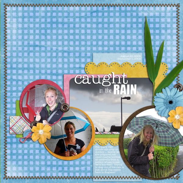
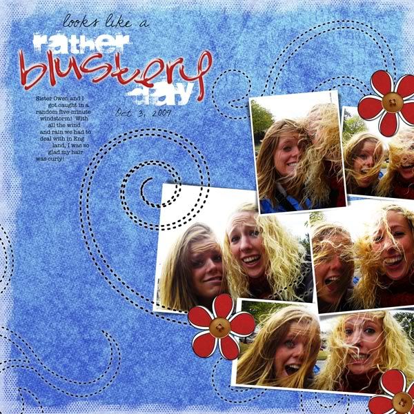
The next few pages I had queued up all had minimal photos (anything less than four is minimal to me), so I decided to take advantage of some of the new ScrapMatters Tuesday Template challenges. I like how fun this one turned out (and this is the one that will be next to the "Blustery Day" page I posted previously):
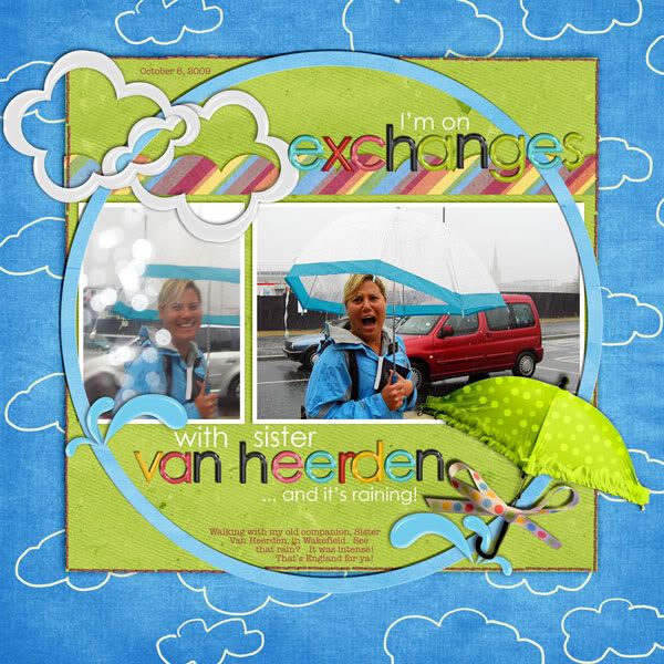
Tuesday Template 4/6 by Trixie Scraps
Rainbrella blog train by craft-tastrophic, LDrag Designs, and Sherri Tierney
rainbow paper by Misty Cato
pink stitching from So Long to Summer by Andilynn Designs
9 to 5 alpha by Krystal Hartley
fonts: Century Gothic, American Typewriter
---
Another for the Tuesday Template (this is today's Tuesday Template!). I love how the blend turned out against the paper, and the titlework, too (which also used a blend; the alpha is actually black).
Tuesday Template 04/13 by Sarah Bennett
Called to Serve (April's LDS blog train) by Chelle's Creations; ShellyMarie Scraps; The Latest Scoop, Too; and Garden Girl Designs
Simply Stamped Alpha: Charcoal by Andilynn Designs
fonts: Edwardian Script ITC, American Typewriter
---
All right; just one more!
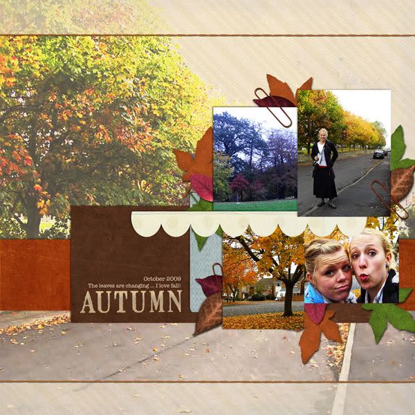
Tuesday Template 3/31/09 by Sahlin Studio
Fall Frolic by Andilynn Designs
titlework altered from Words Matter: Fall Frolic by Andilynn Designs
font: American Typewriter
---
Phew; all caught up! Thanks for looking!


1 comment:
Great LOs--all of them. Fun to get a sneak peek at some of your newer ones.
I really like the "graphic" design one you did. I think it showcases those photos really well and it will probably add a nice variety (of LO) to the album. Wow. Does this post make you feel like you've accomplished a ton?
TWO MORE DAYS!!!
Post a Comment