And yet, I think I've only done, uh, one other two-pager for this entire year. Well, here are two more! Two-pagers are ambitious -- they really do take me about twice as long as your average layout -- so you're seeing four days worth of work.
---
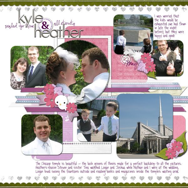
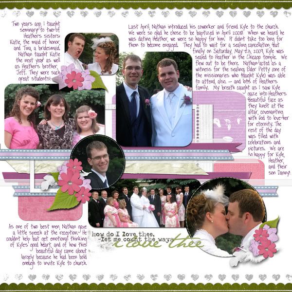
Here's the first -- pictures from a Memorial Day weekend wedding. When I set out to scrap these photos, I began digging through my stash for a template -- something with soft curves (to reflect the beauty of the day) and something with a zillion spots for photos (obviously). I soon realized I wasn't going to have anything that fit the bill so I started drawing out shapes with my rounded rectangle tool (with a few circles for good measure) and made myself a template (I do this fairly often, actually, but usually it's just for simple blocking -- so this was a step up for me).
Then it came time to pick colors (or, rather, find something in my stash that matched the established colors in the pictures). I tried out quite a few different things before hitting on just the right color combo by combining two different kits. Then came the elements from those kits (I always struggle with elements, but I think I did okay here) and the ribbons for continuity across the page (Britt's "My Ribbon Jar" is the staple of a good chunk of my layouts, if you haven't noticed -- best $3 in digi-supplies I've ever spent). My computer was grinding every time I saved as it had something like seventy Photoshop layers (per side) to deal with.
The layout was stunning ... and then I wrote all over it. ;-) Yes, it's still pretty,but it's not quite as visually amazing as it was (the white space was setting off the photos very nicely). But do you think I'm about to erase all those written memories?? Nuh-uh!
Sunshine in My Soul by Britt-ish Designs
pink papers, pink flowers, and wordart from Loverly by Sahlin Studio
most ribbons from My Ribbon Jar by Britt-ish Designs (one was from Sunshine in My Soul)
In the City Alpha by Sahlin Studio
Glitzy Paper Dot Alpha (recolored) by Britt-ish Designs
stamped heart border is from a paper from the Sisters for Life add-on by Britt-ish Designs
We're Just Dating by Britt-ish Designs
fonts are Susie's Hand and Pea Johanna
---
The second two-pager is, technically, not a two-pager -- the design does not continue over two pages and they stand alone as separte layouts. But they are variations on the same theme (Logan's preschool) and they use the same color scheme, kit, and alpha. I've noticed in my printed album that even this kind of continuity makes for a visually-pleasing two pager. Even the pages in which I used the same template twice (with different photos -- obviously -- and different kits) or where I even just used the same alpha for my title look nice next to each other.
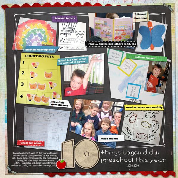
The first was for a "Ten Things" challenge at ScrapMatters and earned a spot in the Gallery Standout thread!
credits:
Teacher's Pet by Bren Boone
Doodletime by Tracie Stroud
My Ribbon Jar by Britt-ish Designs
fonts are Arial Black, Arial Narrow, and BBD_Teacher's Pet (part of the Teacher's Pet kit)
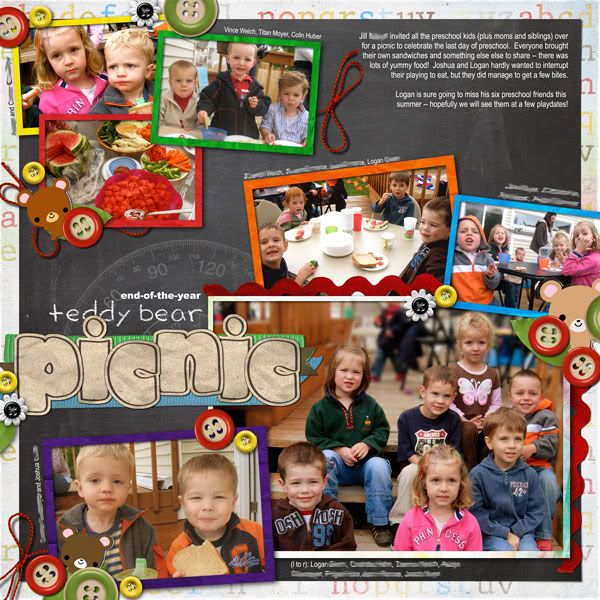
And the second is for a ScrapMatters technique challenge -- selective blurring. I've used this technique before, but it had been a long time, and it really helped the main photo, I think.
credits:
ScrapMatters Tuesday Template (January 27, 2009) by Geeky Diva Designs
Teacher's Pet by Bren Boone
bear, leaf, and some buttons from Yippee Skippee by Britt-ish Designs
papers for photo frames from DigiScrap Addicts contest freebie by Pineapple Plantation Designs and Bren Boone Designs
Chubby Alpha by Andrea
fonts are Arial Black, Arial Narrow, and BBD_Teacher's Pet (part of the Teacher's Pet kit)
I realized after I uploaded this that I hadn't dated it. Oops! It's fixed in my copy. :-)
---
There you have it -- thanks for looking! (And reading to my rambling!)




2 comments:
Cute pages!!
I could have sworn I've commented on these pages before. Or maybe it's just that I've already looked at them over and over and over. These are such great pages! The selective blurring looks fantastic in that last LO! I've got to try that!!
I love your idea for 10 Things Logan learned in pre-school. What a great way to keep some of his work and art without actually keeping it! I love the staples in the corners--they look so real! The ric rac really helps ground the page and you couldn't have chosen a better font for the title. I love it the whole page!
The wedding page looks beautiful. Again, you are masterful at title work--it looks fantastic. I love the little "&" symbol you used. You have a great knack for being able to fit tons of journaling and pictures on a page. Nice work!
Post a Comment