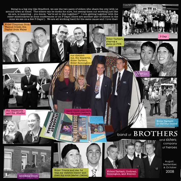
I did this one on Saturday afternoon. I really like how it came together! I hadn't meant to have the pops of color in there; originally I had journaled on the photos; then I did just plain white journaling strips. But it still needed something -- so I clipped bright papers to those strips and I thought the result was fantastic!
Template #121 by ScrappingwithLiz (freebie!)
Seriously Solid paper pack by Sarah Bennett (freebie!)
fonts are Century Gothic, Charlemagne Std, American Typewriter
---
In the same vein as the last layout, I began this one by combing through Julie's Bradford albums to find the pictures for this page -- have I mentioned before how difficult it can be to group these pictures together? I breathe a sigh of relief now when I come to a P-Day activity or a baptism or something that are grouped together and are obviously meant to be one page. ;-)
Still, these pictures are definitely fun and this page came together pretty fast since it was a lift (a lift of a template, even).
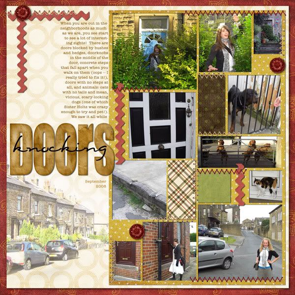
And technically I don't think Julianne was knocking doors in that last photo there, but there were NO pictures of her on this page otherwise! We can't have that. So I found this picture of her on the streets of Bradford, in the daytime. Works for me.
a lift of virginiajen's Happy New Year 2009
A Little Bit Country by the ScrapOrchard Seedlings
stitching from Where the Heart Grows by Golden Girls Digital Designs
Stained Alpha by Designs by Sarah Bryan
fonts are Eight Fifteen and American Typewriter
---
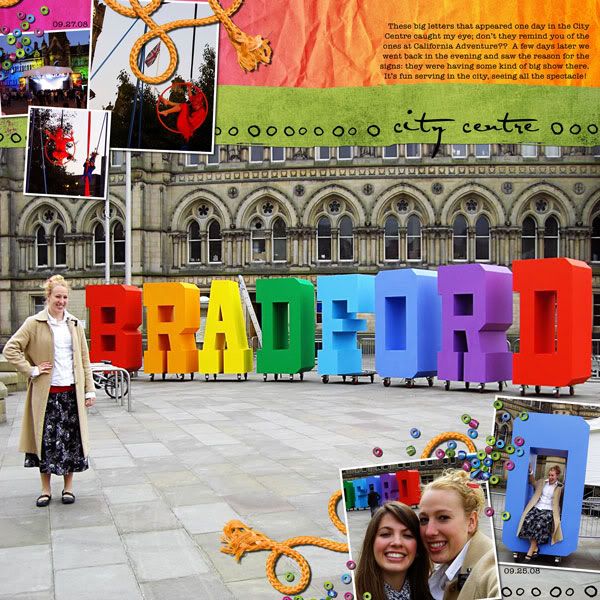
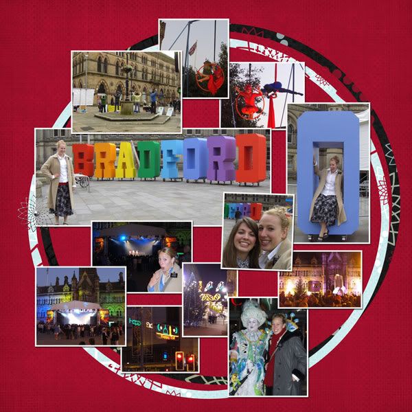
This layout started out like the other two, with me combing through Julianne's albums trying to group ALL her pictures from the Bradford City Centre together, no matter when they were taken. I emerged with about twelve pictures I was trying to cram onto one layout. I was in the middle of trying to make it look decent (I was working without a template and it was not going well) when my computer crashed. Since the boys were up from their "naps" (yes, quotation marks) anyway, I tabled the layout for the afternoon and took them upstairs for awhile.
I happened to talk to my mother-in-law a couple hours later, and she put in a special request for some of the very photos I was working on. Knowing she loved those photos so much changed my perspective on the page; I scrapped (haha) the idea of incorporating all pictures and just focused on this one (well, maybe you'd call it two) event at the City Centre. (Most of the other pics are Christmas ones, and those really can wait until later.)
I also decided to completely start over. Suddenly I knew the kit I was using wasn't going to work, the design wasn't going to work -- so I opened up a new document altogether. (But, in case you're curious and want to see how far this layout really came, I uploaded my half-finished layout that you can see here. I may revisit the design concept later because I think it will work with fewer photos.)
I had seen a great layout a week or two back in the ScrapMatters gallery and decided these pictures would really work with that design, so I lifted it. And I remembered to run some actions on the photos (very helpful). And I picked a kit that was just saturated in color.
And that's how I came up with my new favorite layout of all time. (I think I get new favorites almost every time I scrap. That's a good thing.)
Lift of chia's Flying High
Everyday Memories by Chelle's Creations and Juno Designs
fonts are AL Sandra and American Typewriter
---
Thanks for looking!


1 comment:
I love the color pops in that first LO. They definitely make the LO! I can't believe how many photos you got on there and it looks great! You really are amazing at this!
Love the 2nd LO--I think I already commented on it at the forum. That blended photo is awesome and I *BIG TIME HEART* your photo groupings. I thought it was brilliant. But the blended photo really adds so much that I went to the LO you lifted and ended up lifting that! So you inspired me! Oh, and it doesn't matter that Julie isn't *technically* knocking doors--the photo totally made sense to me because when you are knocking doors you are always out on the streets. It definitely fits!
Okay on the 3rd LO I clicked on your first try first and I didn't think it was bad at all. You definitely had some awesome photos to work with. But then I saw your actual LO and WOW--I'm blown away!! It looks fantastic! I LOVE how big that photo is (and it deserves to be the focal point for SURE!). The rest of the photos you chose to go with it look really good and you still (STILL!!!!) fit so many on the page. Wow. I am in AWE. If I have the right photos to work with, I may have to lift this. I love the seed bead scatters! Great job!
Post a Comment