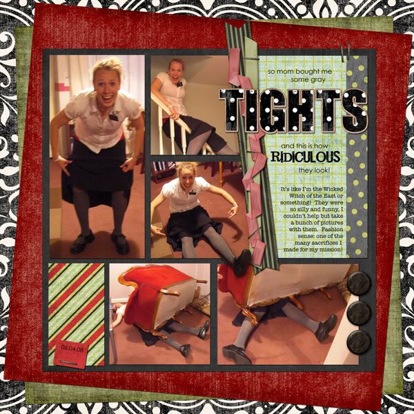
This layout can't help but be awesome just because of the pictures. Aren't they great?? So Julianne.
But here's my question: are opaque gray tights really so fashion-backward? Because I totally had a pair when I was in college that I wore every Sunday throughout the winter ... for years. I thought they were great! And they really held up well. Of course, this was, like, ten years ago, so maybe they really are that bad now. (Man, I'm old.)
Tuesday Template 7-28-09 (altered a bit) by WM[squared] Designs
15 across, 42 down by Ziggle Designs
several papers from Dinner Party by Shabby Princess and Sara Carling
staples from Apple Cart #1 by Ziggle Designs
Polkee-dawt alpha by Britt-ish Designs
fonts: Century Gothic, Jailbird Jenna, and American Typewriter
---
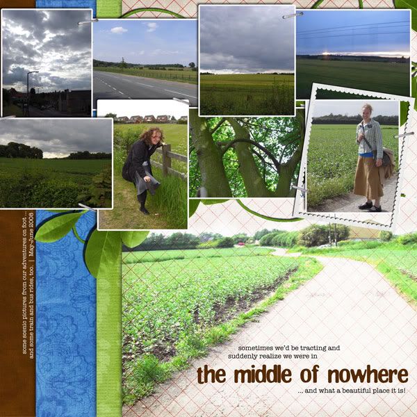
I struggled with this next layout. Don't get me wrong -- the pictures are beautiful and I am pleased with the overall result -- but I was scrapping while my kids were wreaking havoc.
Okay okay -- here's the whole gruesome story:
First off, naptime was a total bust at my house that day. So was "quiet time," really, though the kids did seem to be somewhat entertained playing in the toy-pit that is our basement while I scrapped at the desk in the corner. So I went ahead and started on this page.
I was trying desperately to turn a four-photo layout into a nine-photo one (I was looking to lift a layout I spotted in the gallery because I loved how she stacked her background papers). But how could I do this without totally covering up the stacked papers that I loved so much? And besides -- scenery pictures are really hard to scrap, I've decided. Typically the reason you take them in the first place is to show the beauty of it, and I didn't want each little photo to be overwhelmed by all the others ... but then I didn't see any other way around it (because it also seemed pointless to scrap each of these photos by themselves)! The whole thing was enough to give me a conniption.
Meanwhile, my two-year-old had stopped playing with his toys and was tearing apart daddy's nice headphones. Nathan is generally laid back about the kids touching his things -- but the headphones are sacred. I felt sick when Logan showed me the ear piece ripped off and wires exposed.
And then, a minute later, my computer abruptly rebooted itself and I hadn't saved ... not a thing. An hour's work down the drain!
It probably was a mixed blessing in disguise, because while I went upstairs to cool off, I was able to see in my mind how I could get this layout to work. Awhile later I came downstairs and rebuilt the page in maybe half an hour.
And Nathan's headphones? He soldered them back together. With his soldering iron. And they work. (Yes, he's the man.)
So. All's well that end's well, I guess.
Here's the famed (infamous?) layout (which I actually really like):
this was inspired by kimbytx's Doctor M
Natural Wonders by ScrapMatters Designers
staple is from Sunshine in My Soul by Britt-ish Designs
fonts are American Typewriter and Clingy
---
This one was more therapy-scrapping than anything else. After the last layout, I wanted something that would come together quickly and easily. Ask any scrapper which kind of layout is easier -- one with nine photos or one with three -- and I'm guessing they'll all say three. This was the case here, and while this doesn't give me as big a bang for my buck photo-wise, it was a layout I could do in under an hour.

A lift of becca372's "cutest"
Where the Heart Grows by Golden Girls Digital Designs
font is American Typewriter
---
The boys did take naps today, and while Josh's was way too short, I was able to get the bulk of this done while they slept.
It was really quite lucky that I chose this kit -- I try not to spend a long time picking when I'm doing these pages, so when I saw Julianne's green shirt and Sister Lomax's blue one I went for this blue-and-green kit I knew I had stashed away. Then I saw the gradient paper (and the gradient string) and the arrows and thought, hmm -- how appropriate for scrapping this transitional page! It matched the journaling well (which I adapted from a few paragraphs from her e-mails and photo captions ... this is what I've been doing for all the pages, actually, and I'm indebted to April for all her work in getting that up and archived on the web so it's accessible to me!)
One more thing regarding my color scheme -- the bottom right picture was SO distracting originally, what with its bright sunny colors: the door was red, the bench was a vibrant teal, the window sill was lemon-yellow. I used the selective-recoloring trick from a past Saturday Special and, voila -- instant paint-job! I so wish I could Photoshop my house!!
Template 10 by Scrapmuss Designs (ScrapMatters' Tuesday Template for 08/04/09)
SYTYCD Week 1 by Studio Flergs
Give It to Me Straight by Amanda Heimann
My Ribbon Jar by Britt-ish Designs
Date Stamped by Britt-ish Designs
fonts are Elephants in Cherry Trees and American Typewriter
---
Thanks for looking! (And remember: command-S is your friend!)


No comments:
Post a Comment