But first -- a couple pages all the way from last week that I didn't post yet...
---
I'd been looking forward to these pictures for awhile, if only because I downloaded the CUTEST bowling stuff a few months ago and have not been able to use it yet! This page came together in under an hour, which is always good.
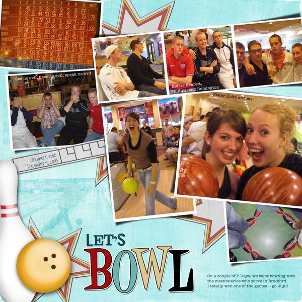
Template #48 by Jill & Jack Scraps
Bowl-O-Rama by Ziggle Designs (a freebie; get it here and here)
wordart (altered) from Let's Go Bowling add-on by Andilynn Designs
fonts are Jailbird Jenna, Caitlin, and American Typewriter
---
The inspiration for the title on this page is directly from Julianne (it was the caption to one of the photos). Luckily I had an umbrella in my stash to dress up this page, too.
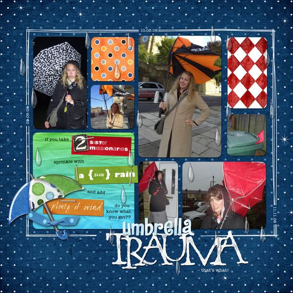
Template 24 (inspired by Jacinda) by Chrissy W.
Rain, Rain by Kristin Aagard
dotty orange paper by Amanda Rockwell
diamond red/white paper from Whoville by Ginger Scraps
gradient paper from Color My World paper pack by Chelle's Creations
journal strip papers from Technicolor freebie by mgl Studio
Doodletime by Tracie Stroud
staple from Sun Porch by Amy Teets
Alphabetical by Britt-ish Designs
Detention Alpha by Krystal Hartley
fonts are: Oh Photo Shoot!, Light & Black, Gill Sans Ultra Bold, GG Basic, Baby Bowser, and American Typewriter
---
And now for the pages I worked on today. Here's the first one. I love the colors on it but am a little undecided on whether I like the blended photo in the background (the same photo is cropped and used in the upper right block). What's your opinion?
I do love the journaling, though. It's all Julianne's words (pieced together and edited, but still her words); it tells the story with her unique voice. I do this as often as possible, but this page is one of the better examples. Feels much more authentic. :-)
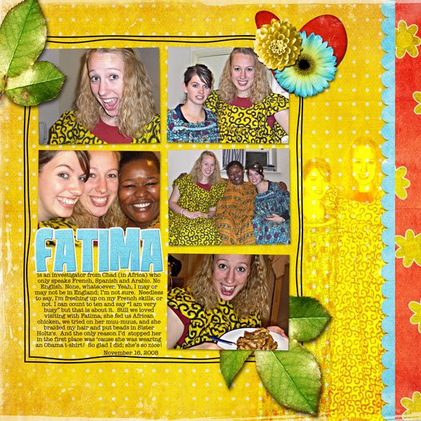
template is NSD 2009 freebie by Jen Caputo
Summer Bling by Matahati Designs
fonts are Tan Patty and American Typewriter
---
And a second page. I feel like this is three separate "stories" (i.e., sisters sleeping, sisters writing letters, and big photo shoot) so I'm pleased that the page feels more or less cohesive. And I did it without a template, even! :-D
I just realized I forgot the date; I added that to my copy.
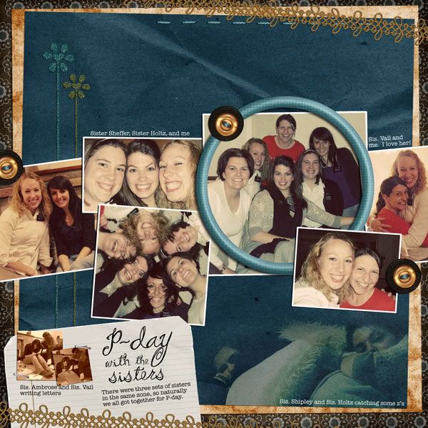
Remember Me add-on freebie by Sarah Bennett
fonts are Pea Stacy's Doodle Script and American Typewriter
Thanks for looking! Up next ... Julianne's CEMETERY pictures!




3 comments:
wow, no template? that is great.
you don't seem to need one!
I really like the circle photo and the repeat of a circle of faces ... great job
oh, I thought I'd be able to comment on EACH photo - it is just each day, huh. I love the repeat of the color in the yellow one= the silhouettes are fantastic! wow
and the umbrellas are really funny & they kept on smiling. Your layouts are each so colorful and so unique. Great job! AND you are getting the house completed - it will be like adding a get away to have the basement finished, next summer when it is hot you can take down a dorm fridge and microwave and never come up to the heat (its cooling off now, isn't it?) CANNOT wait to come visit. Be a week tho
love you
I think I commented on the first two LOs already.
I LOVE the doodle frame on the Fatima LO. I'm no help as to which version is better. I think it looks really cool to have the blended photo but a small part of me finds it a little distracting from the rest of the LO, too--unless you flipped the whole LO and you were able to put the blended photo on the side with the title. That might make it feel more balance...maybe? But I really do like the blended photo! You're right--the journaling is great--so much personality packed into that paragraph!
The 2nd LO is amazing! It looks fantastic with so many photos and you didn't even use a template! That is very impressive. I may have to lift the design. I like how the 3 stories are even kind of sectioned off in the page. I like how you did the layers and placed the ribbon on there diagonally! It gives the LO a fun feel!
Post a Comment