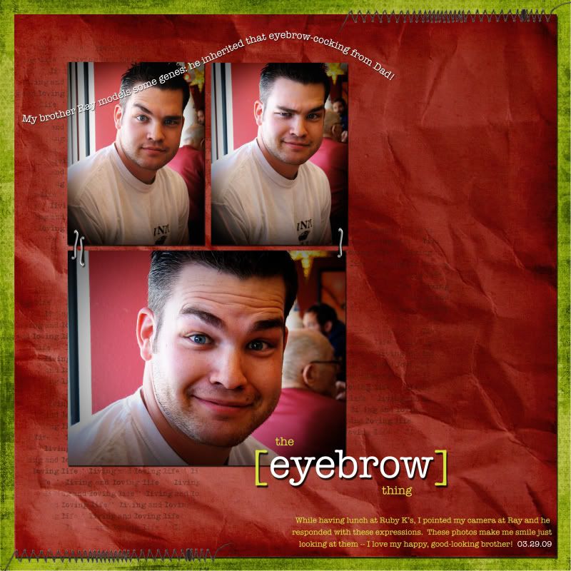
I think, as a general rule, I'd answer that it's the composition. I love seeing layouts that have photos arranged well, with elements delicately placed.
Yeah, I'm always underestimating the power of some fantastic pictures.
And so it is in this layout: it's simply my good-looking brother that makes the layout so nice to look at! I didn't feel like I needed a whole lot of elements (count 'em -- I used only sixteen layers this layout -- which is, like, a new record low for me). The photos shine on their own.

credits:
love life by sahlin studio (Scrapmatters designers challenge round 4)
I used the actions Fresh and Colorful / Quick Edge Burn by Pioneer Woman
font is American Typewriter


1 comment:
That is so true! I like the simplicity of this layout. The title is AWESOME as usual.
Post a Comment