---
So ... I love this one. One of my favorite layouts of all time. The design, the element placement, the colors -- yeah. Love this. (Is that vain??) It earned a spot in the gallery standout thread at ScrapMatters.
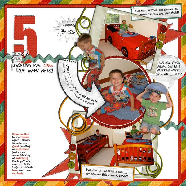
Jokes on You by Sweet Digi Scraps
We're Just Dating v.2 by Britt-ish Designs
fonts: Year Supply of Fairy Cakes, You Are Loved (for the "5"), American Typewriter
---
This one I did for a color challenge at ScrapMatters, and I LOVE how the colors turned out! The 60-30-10 rule in the tutorial that accompanied the challenge really worked. And the template I picked turned out to be awesome -- the cut paper looking like planets was a happy accident that I was happy to reinforce by painting "stars" across the paper using one of Photoshop's standard brushes.
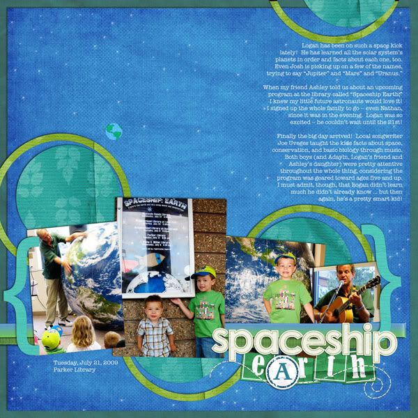
Queen of Scrap template by Denise Beatty Originals (modified)
Natural Wonders (a lot recolored) by ScrapMatters Designers
Teeny Tiny Christmas Alpha and Glitzy Paper Dot Alpha by Britt-ish Designs
earth is from Earthday by Plum Dumpling Designs
ribbons from My Ribbon Jar by Britt-ish Designs
stitching from All Stitched Up by Tracie Stroud
font is American Typewriter
---
A page for Julianne's album. The bulk of these papers and elements were downloaded from kits for DigiScrapAddict's So You Think You Can Design contest.
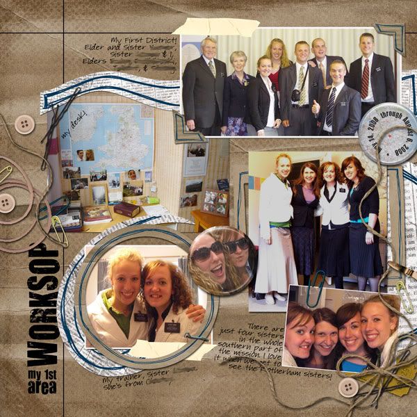
Recycled! by Lindsay Riches
Junk Drawer by Fernlili's Digital Designs
tape from Adventures in Reading by Plum Dumpling Designs
flair by Melanie Fuller (from Ellie's Angels blog)
fonts: You Are Loved, Pea Carlisle
---
I did this for a speed scrap on Thursday night, and what a speedy scrap it was! It started at 7:30, but I had forgotten about it until I uploaded the previous layout at about 8:15 and noticed that thread in the "new posts" of the ScrapMatters forums. But I couldn't sit down and scrap -- we had to put the kids to bed (which has become quite the ordeal since my youngest moved into this new bed ... he was fine the first few nights, but it's gotten worse; what's up??) Anyway, I didn't sit down to scrap until ten minutes to nine, and I had until 9:45 to complete and upload my layout. Typically it takes me at least ninety minutes for a layout -- so I was a little rushed! But I made it ... with five minutes to spare. What's my secret? Well ...
It definitely helped to read the instructions before putting the kids down, so I was thinking about things for about a half hour before I started (and changing my mind over and over and over about what set of pictures to scrap).
It helped to kind of "lift" my previous layout -- I used a lot of the same techniques (which I figure is fine, as they aren't even going in the same albums).
And it definitely helped that the host of the speed scrap, Rachelle of Chelle's Creations, totally scraps in my style -- more about the pictures and journaling and less about the frou-frou. (There have been times that I think about joining the speed scrap, see that the first instruction is "pick ONE picture", and I give up right then and there. Sometimes I enjoy that kind of challenge, as it's so different from my typical layout and I like to try new things and grow, but lately I just have too many layouts that need to get done, and none of them are single-photo layouts!)
Anyway, the instructions included things that might be a struggle for some scrappers -- at least five pics, at least 50 words of journaling, etc. -- but those are almost second nature to me. (The other rules were easy to follow, too: things like adding blue and/or gold to the layout, using brackets, using paint splats, having a title and a subtitle).
Um, I think I've taken almost as much time to write about this layout as it did to actually create it.
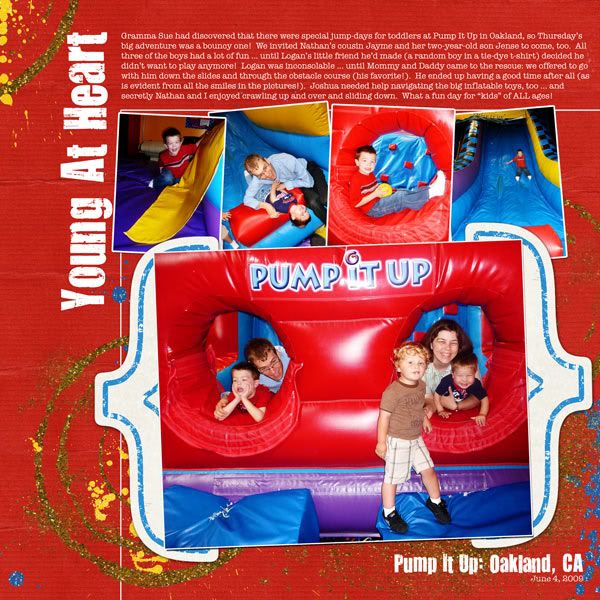
paper and brackets: Natural Wonders by SM designers
Glitzy Spills and Thrills by Britt-ish Designs
Sparkle and Shine by Jennifer Barrette
fonts are You Are Loved and American Typewriter
---
I was so excited to have finished that speed scrap, and not just because I knocked off a layout I've been meaning to do for months ... the participation prize was a beautiful (beautiful!) paper pack. When I saw this particular paper, I knew just what to scrap with it. Doesn't it look like water??
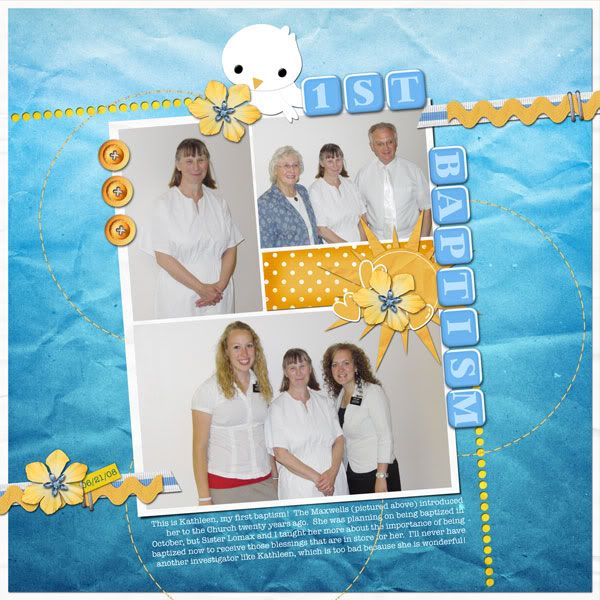
tilt template by Britt-ish Designs
Color My World paper pack by Chelle's Creations
Sunshine in My Soul and Sunshine in My Soul add-on by Britt-ish Designs
My Ribbon Jar by Britt-ish Designs
Pinky-Dinky alpha (recolored) by Britt-ish Designs
font: American Typewriter
---
Thanks for looking!




1 comment:
Wow! You really HAVE been scrapping up a storm! They all look really great.
On your Pump It Up LO--did you mean to make the brackets mimic (only opposite) the "Pump It Up" writing in the picture? It looks great! I love that main photo, too.
That new paper really DOES look like water for your baptism lay-out and I love the "dove" and the colors. It's perfect!
Post a Comment